1 cup Gluten Free Flour
1 cup light brown sugar, packed
1/2 cup butter, softened
1 large egg, room temperature
1 teaspoon vanilla extract
1/2 teaspoon baking soda
1/2 teaspoon salt
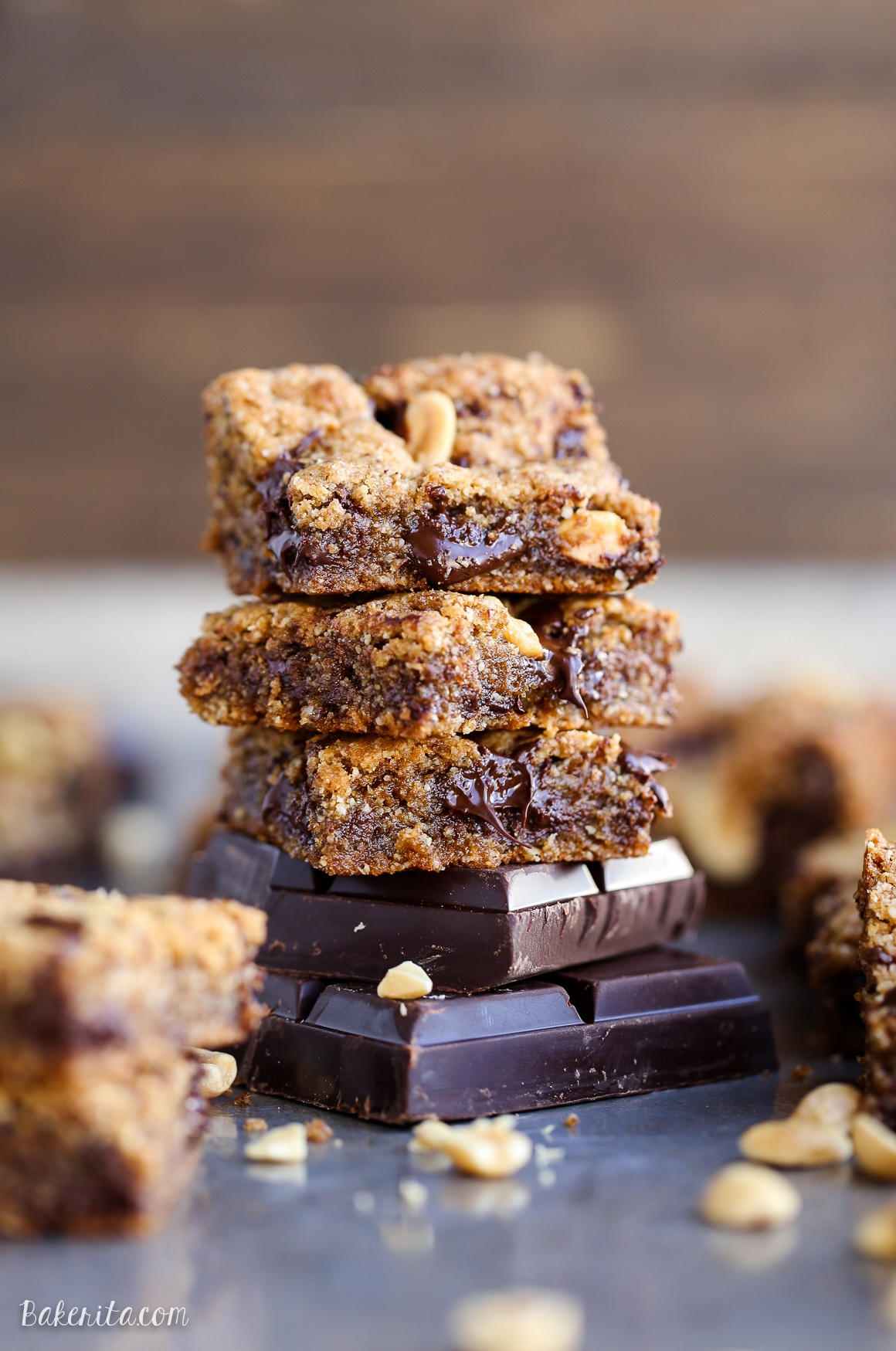
1 cup dark chocolate baking disks/chocolate chips
1. Preheat oven to 350°F. Line an 8″x8″ baking dish with parchment paper and set aside.
2. In a standing mixer fitted with a paddle attachment, cream butter and sugar until light and fluffy, about 3 minutes. Add in egg and vanilla during last minute of mixing.
3. Turn mixer speed to low and mix in flour, baking soda, and salt until just combined.
4. Remove from standing mixer and fold in chocolate chips.
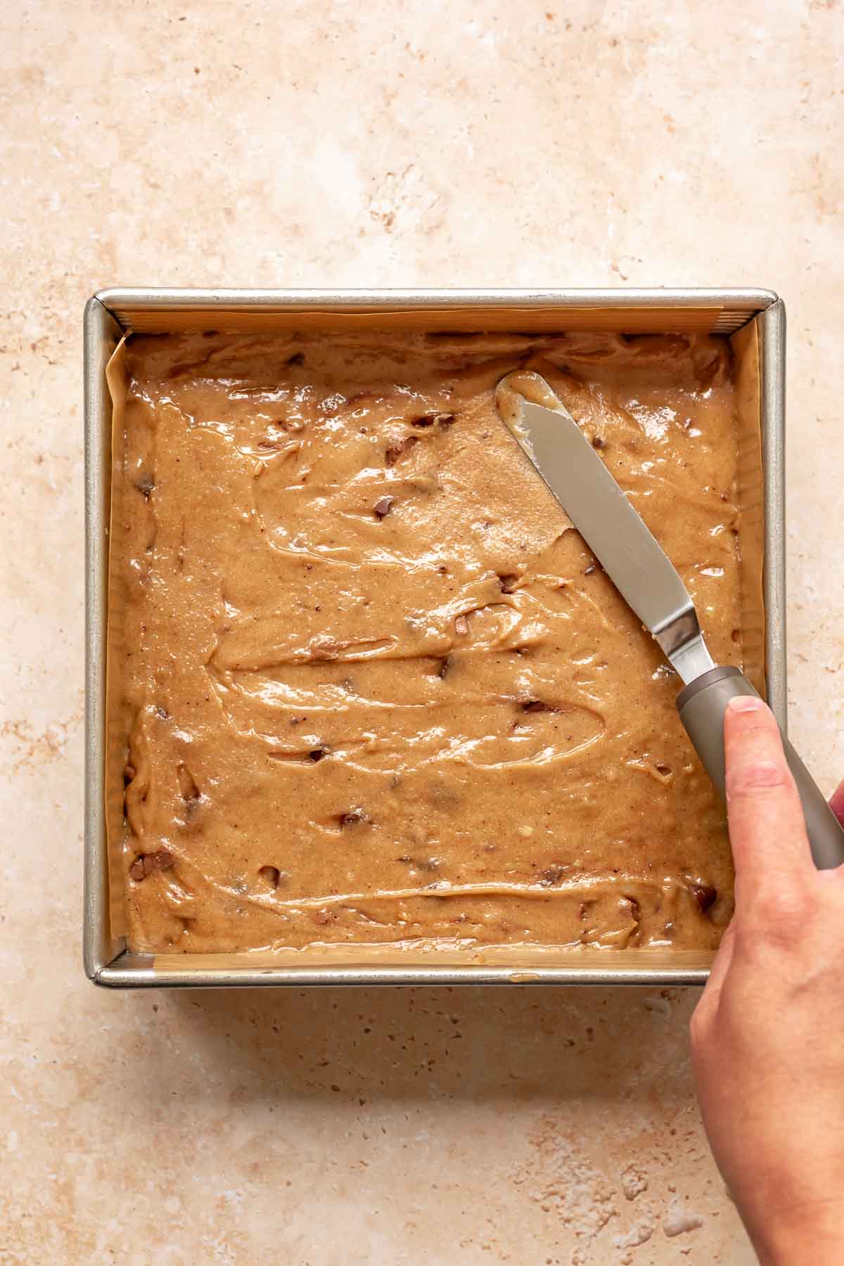
5. Place dough into baking dish and smooth using the back of a spatula.
6. Place dough into baking dish and smooth using the back of a spatula.
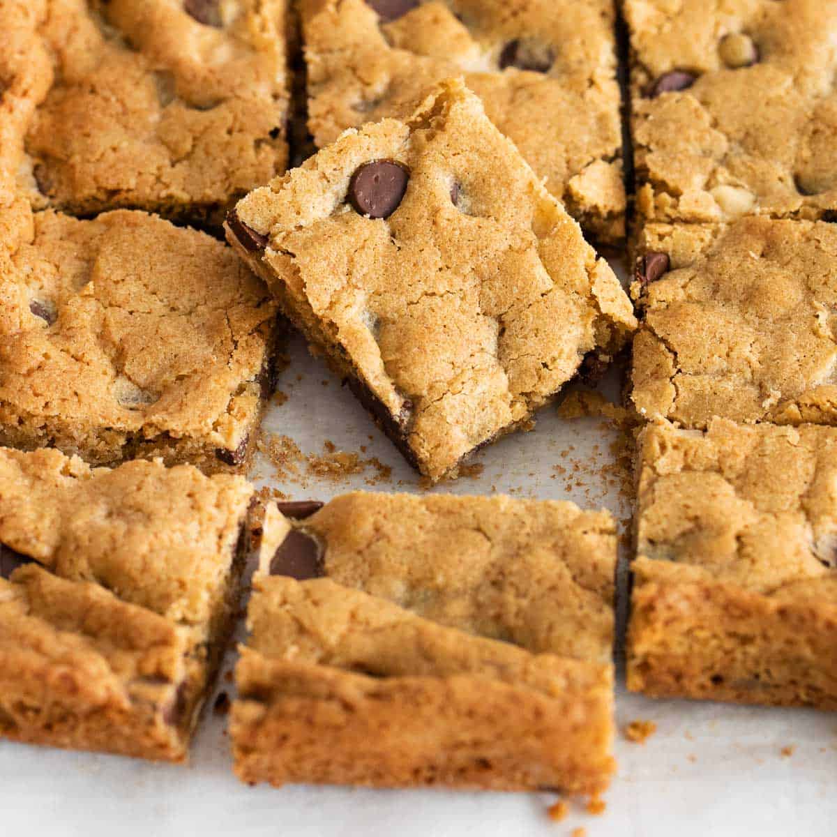
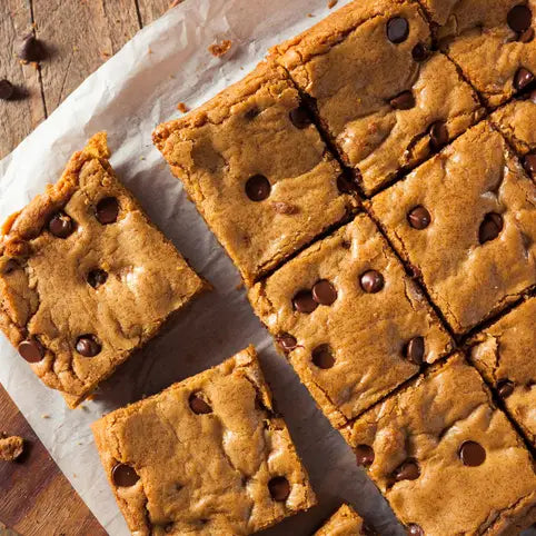
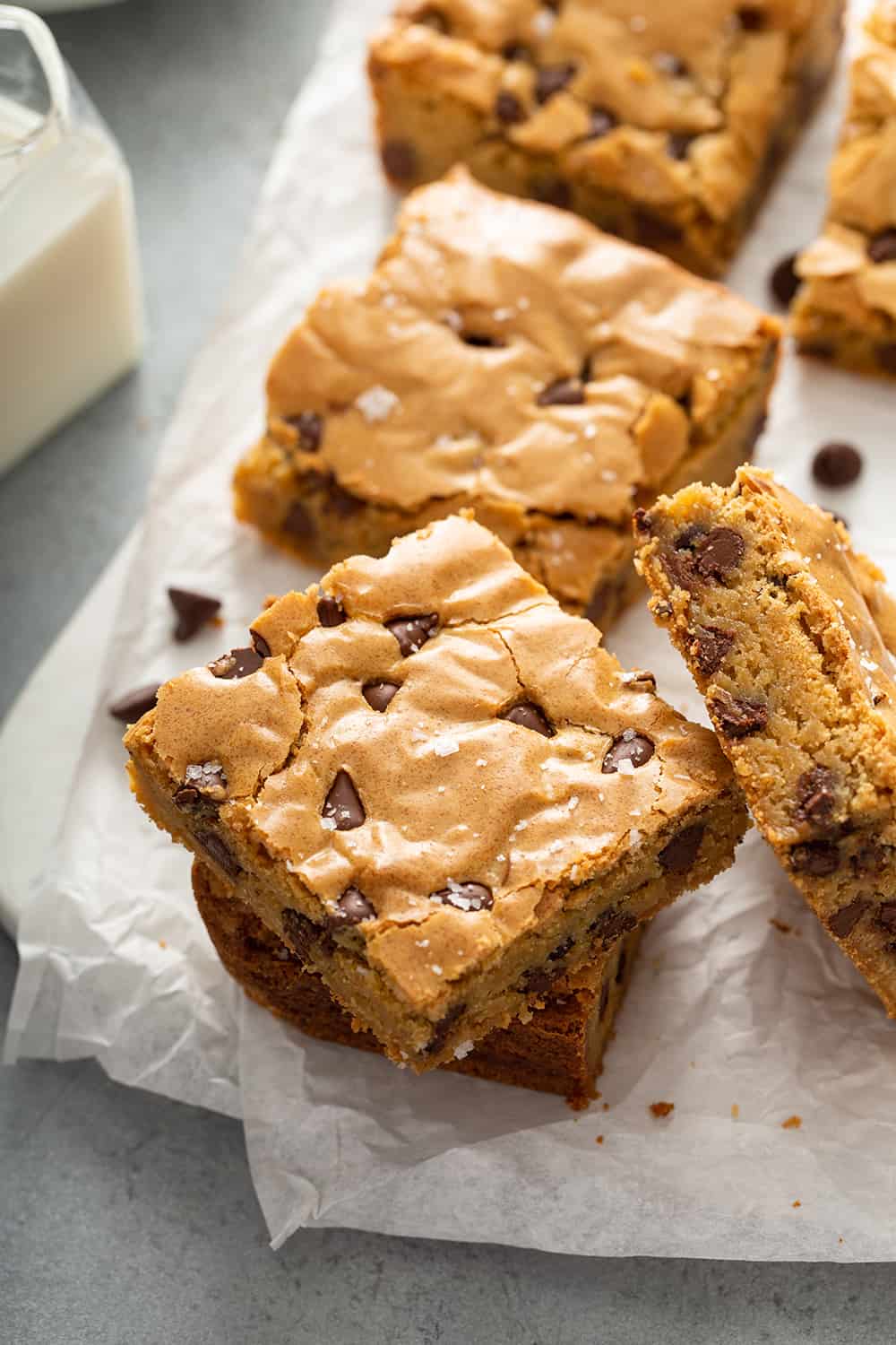
7. Allow to cool for 20 minutes before removing from pan and cutting into 9 squares!
8. Store gluten-free blondies in an airtight container on the counter at room temperature, for 3-5 days.


This website packs a punch with vivid images that lead the viewer through the recipe process, scaled to various sizes that reflect their importance. Despite having small bottom/top margins, the website looks very open and appealing thanks to the thin and elegant typefaces and selective shifts in font weights and sizes.
I like this website's high contrast black-white-yellow color palette, but it's best feature is the text container that puts all the recipe information in a single place. Most other recipe websites force you to scroll a lot in order to read recipe instructions, which is not convenient. This website uses changing background colors, a shifting grid system, and a wide range of type styles, sizes, and weights to present dense information in an incredibly digestable (no pun intended) way.
This website takes the black-white-yellow color palette and the instruction container of Website 2 (though done with less visual clarity) and introduces additional elements to the main body text. Little emojis add character to the text, the large increase in text size for section heads effectively communicates information categories, and in-text highlights call attention to important details like recommended side dishes. While the recipe instruction box is less clear than Website 2, it greatly improves on the body text.
A sense of sleakness is created immediately on this website, with a color palette of black and white with earthy accents. This color palette relies on a more integral design element- the spatious and varied grid system. Images are displayed at different sizes based on their importance, separated by large gutters that create comfortable areas of visual rest.
The black-white-earth tone color palete has been a pattern across many websites I've investigated, but this one does it differently. Normally, white dominates the screen with black conveying information and the earth tone acting as an accent. This website uses the earth tone as a background, with black text boxes holding white text and sometimes earth-tone text. This creates an interesting positive/negative space dynamic that make this website unique and interesting.
Suitably, this website feels like it's in constant motion, and the scroll feature is the basis of that. As the user vertically scrolls, images grow or shrink in the background while text slides in from below, increasing in opacity as it does so. This is complemented by areas of rest where text (at a variety of sizes and weights) sits in a largely empty white area of the screen.